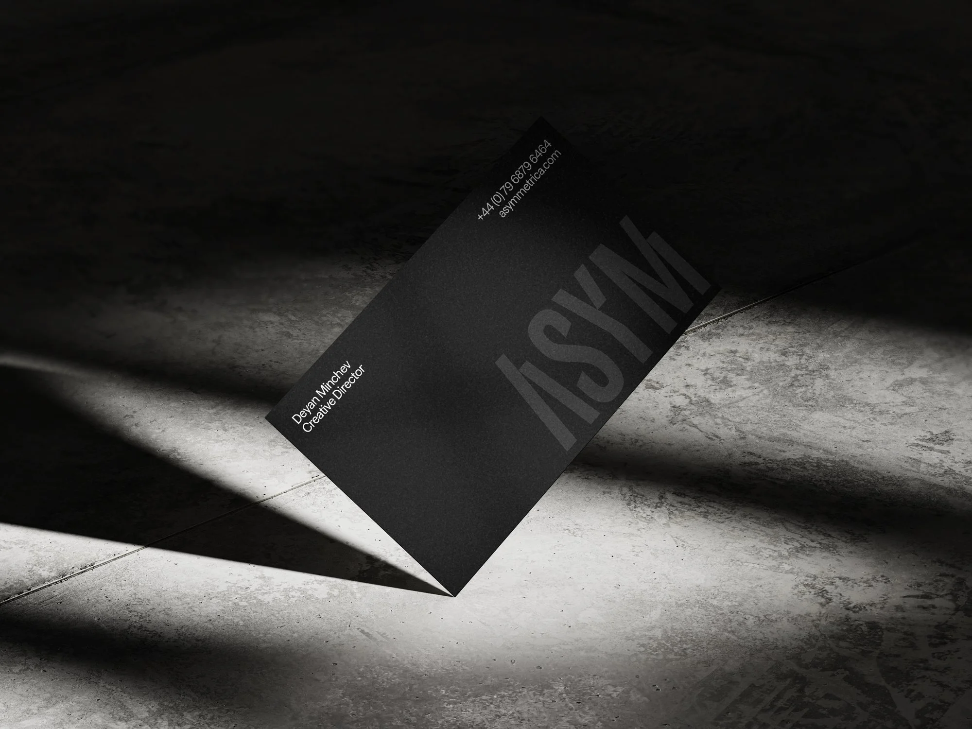
Asymmetrica Identity
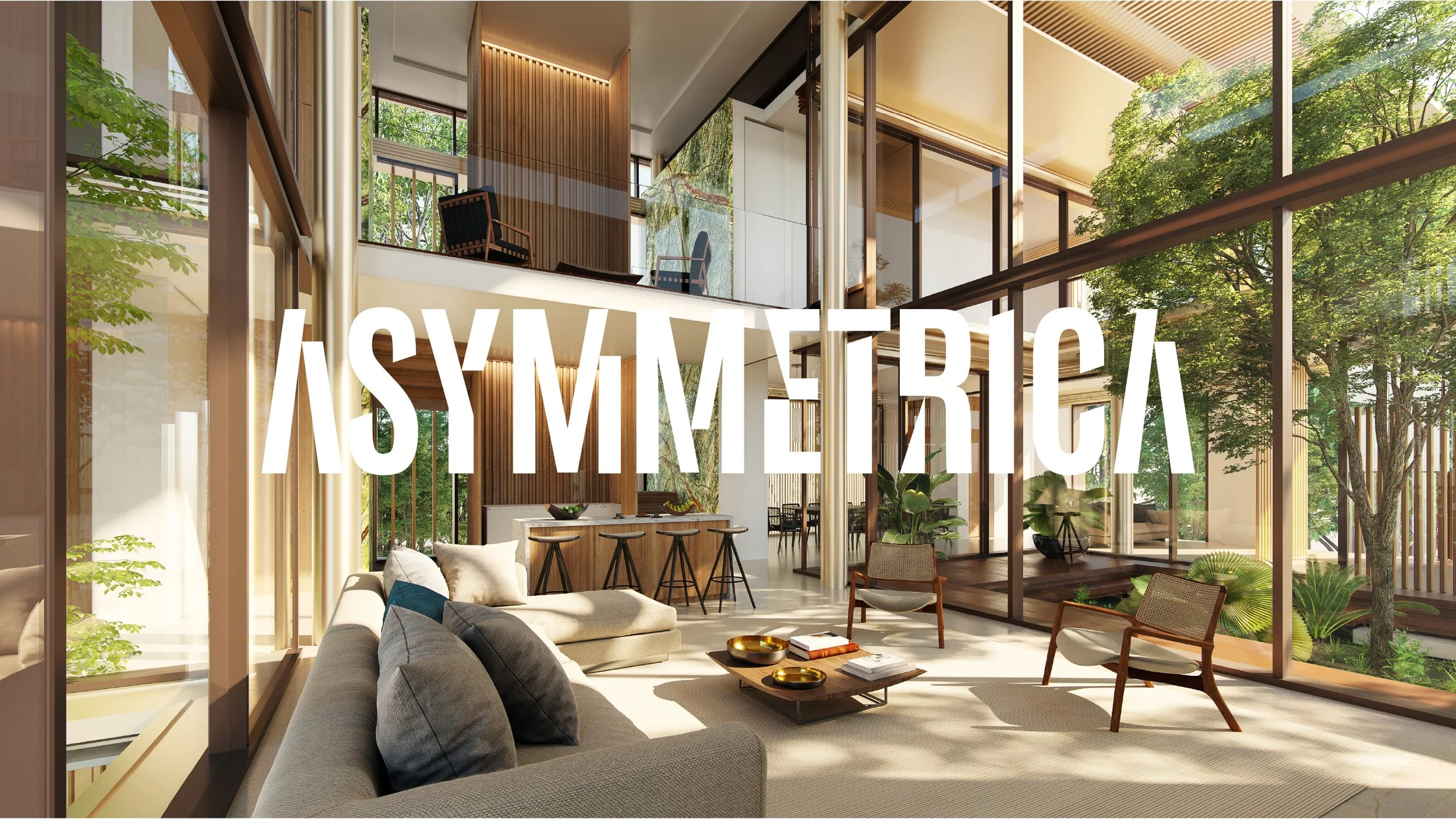
Led by Creative Director Deyan Minchev, Asymmetrica is a London based architectural visualisation studio, transforming architectural visions into compelling narratives through a fusion of art, technology and emotion.
A small team of award winning designers and artists, Asymmetrica collaborates with global brands and developers to create world class visual experiences. We were tasked with building a brand that honoured their reputation while elevating their highly visual output.
Working closely with Asymmetrica’s team from day one, we used collaborative brainstorming, sketching and typographic exploration to develop a series of distinctive creative concepts.
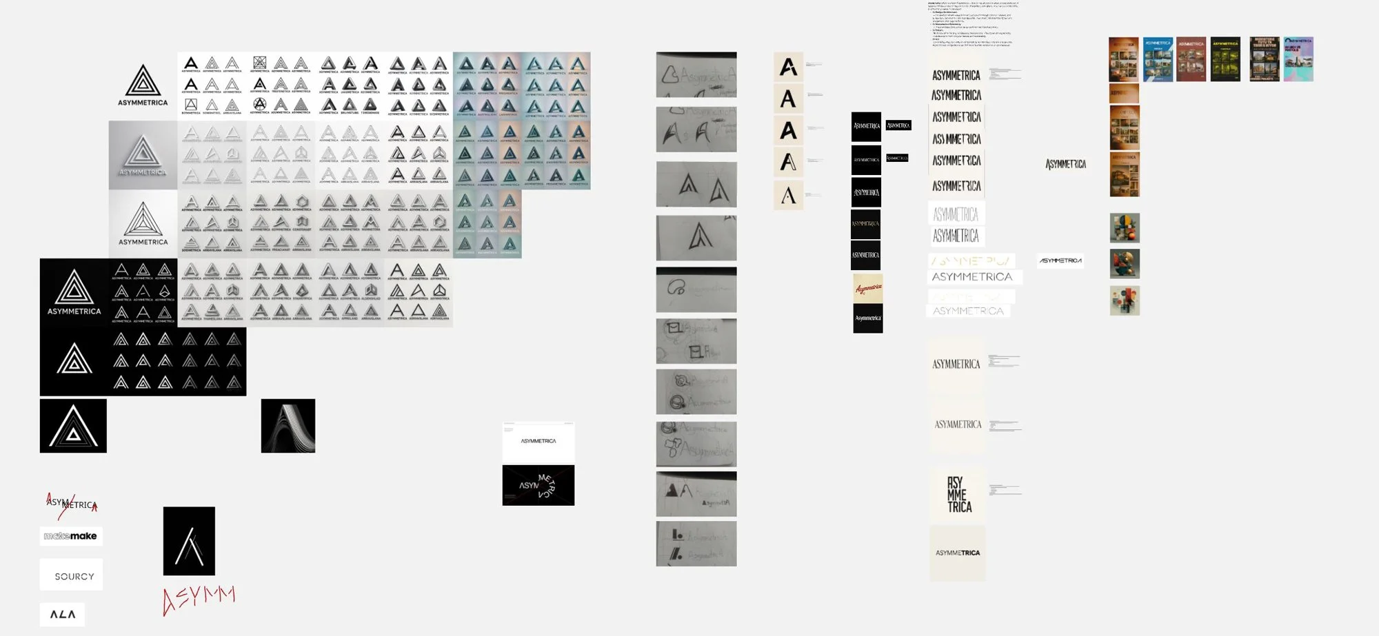
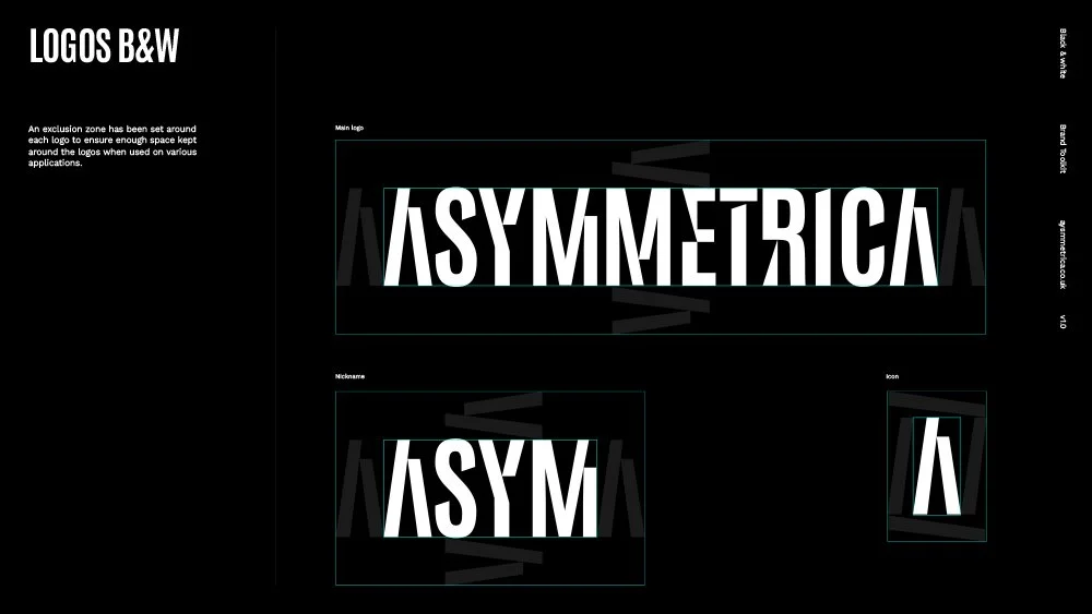
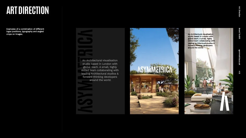
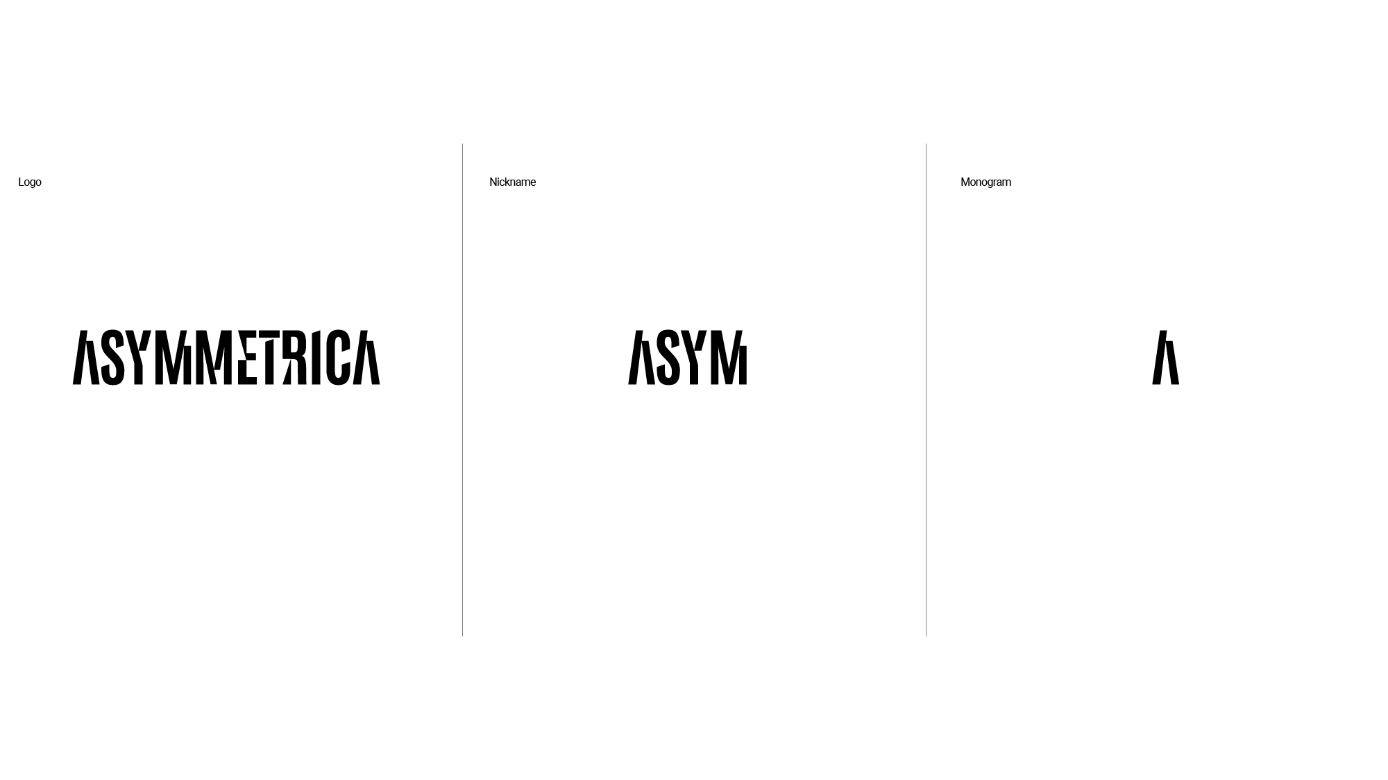
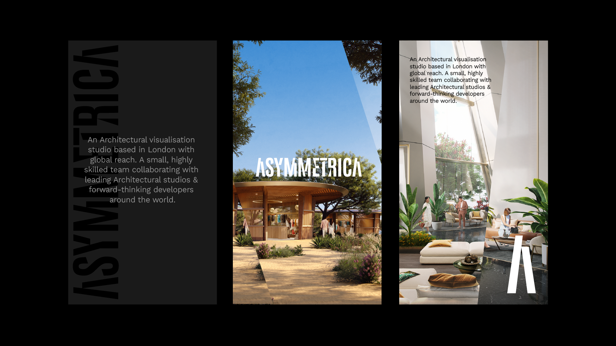
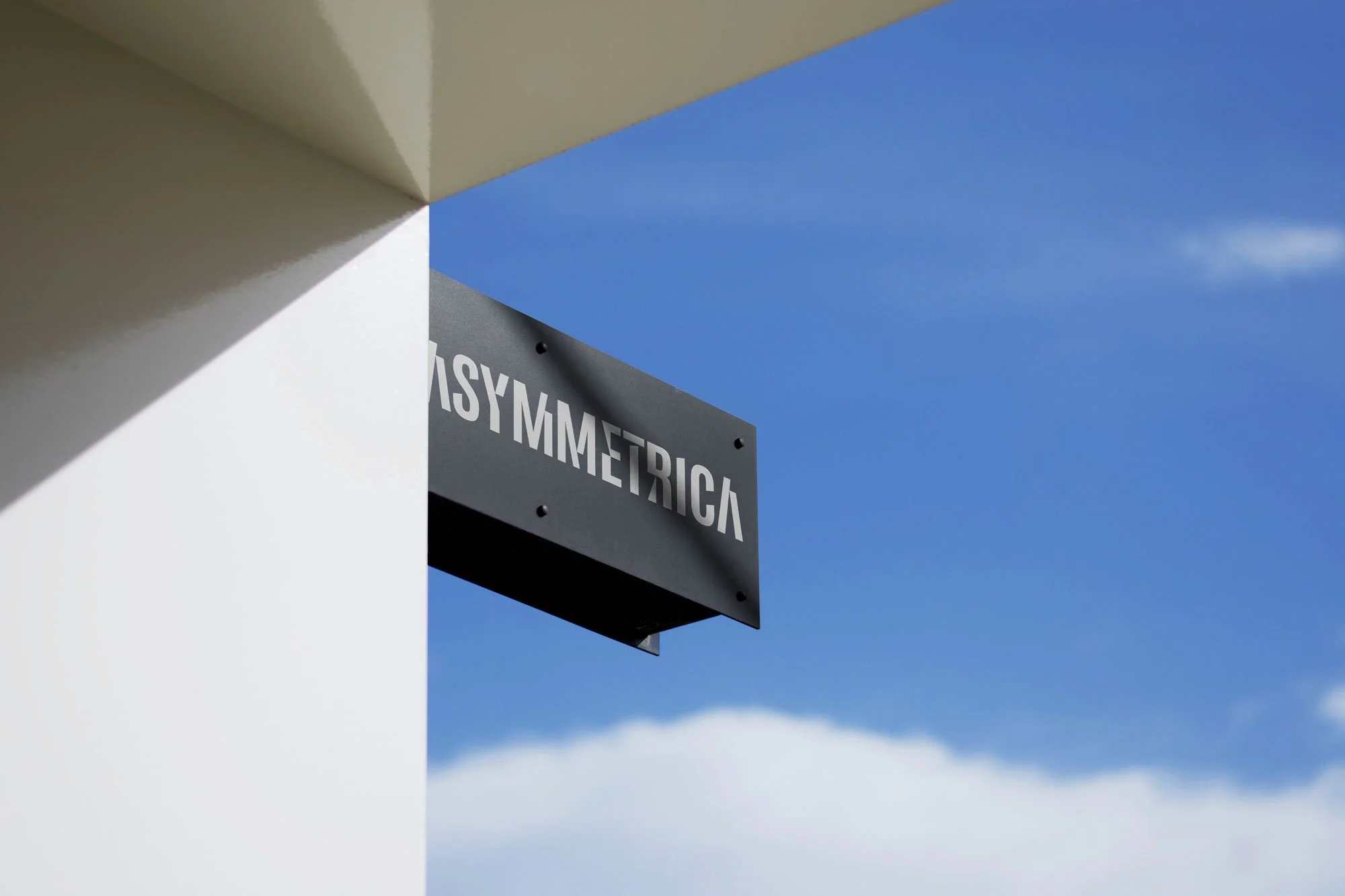
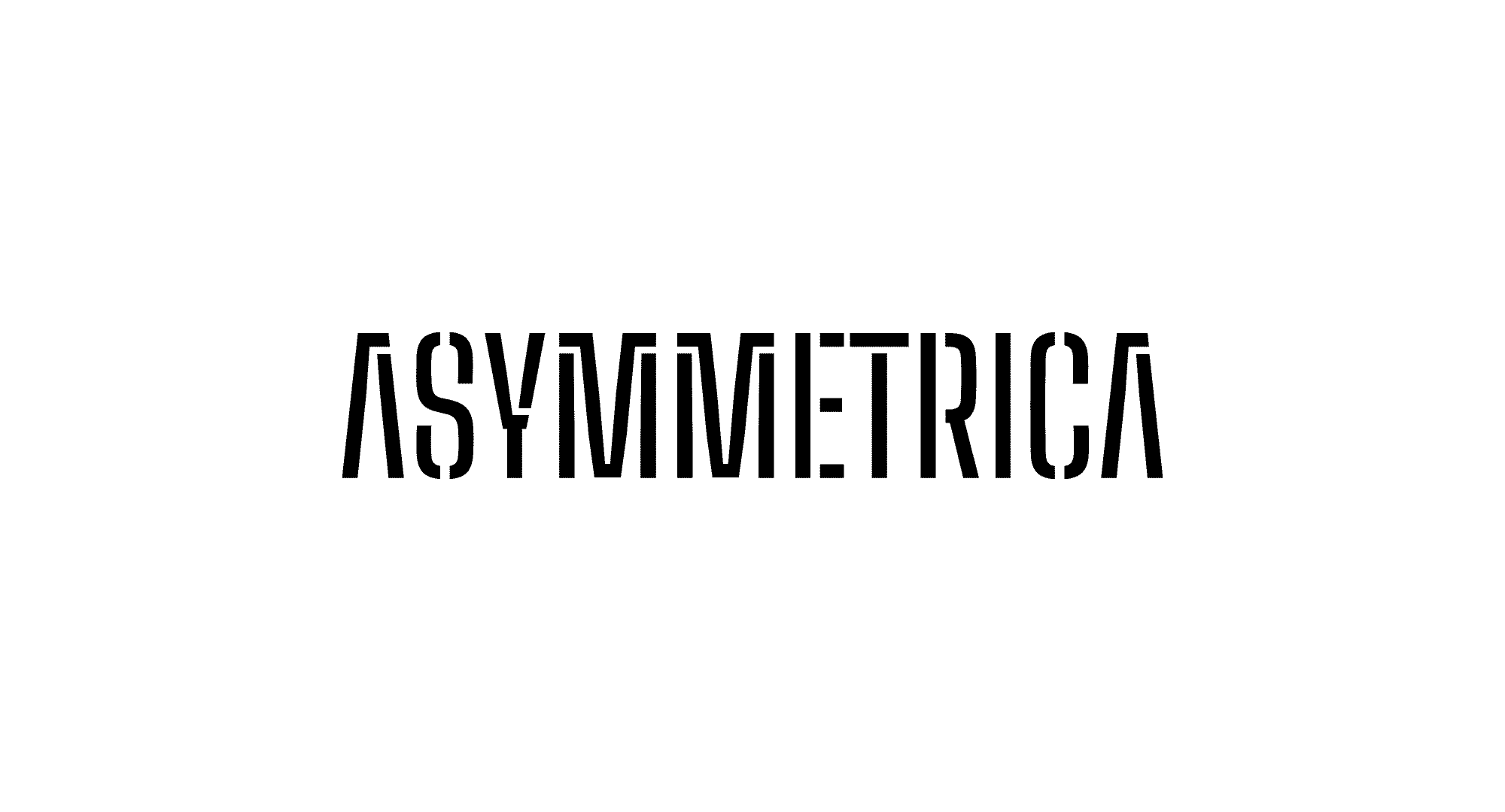
As the final concepts took shape, we retained the uppercase letterforms to preserve a sense of architectural rigidity. From there, we explored ways to fragment and disrupt the typography, creating a deliberate tension between symmetry and asymmetry, a contrast inherent in the name itself.
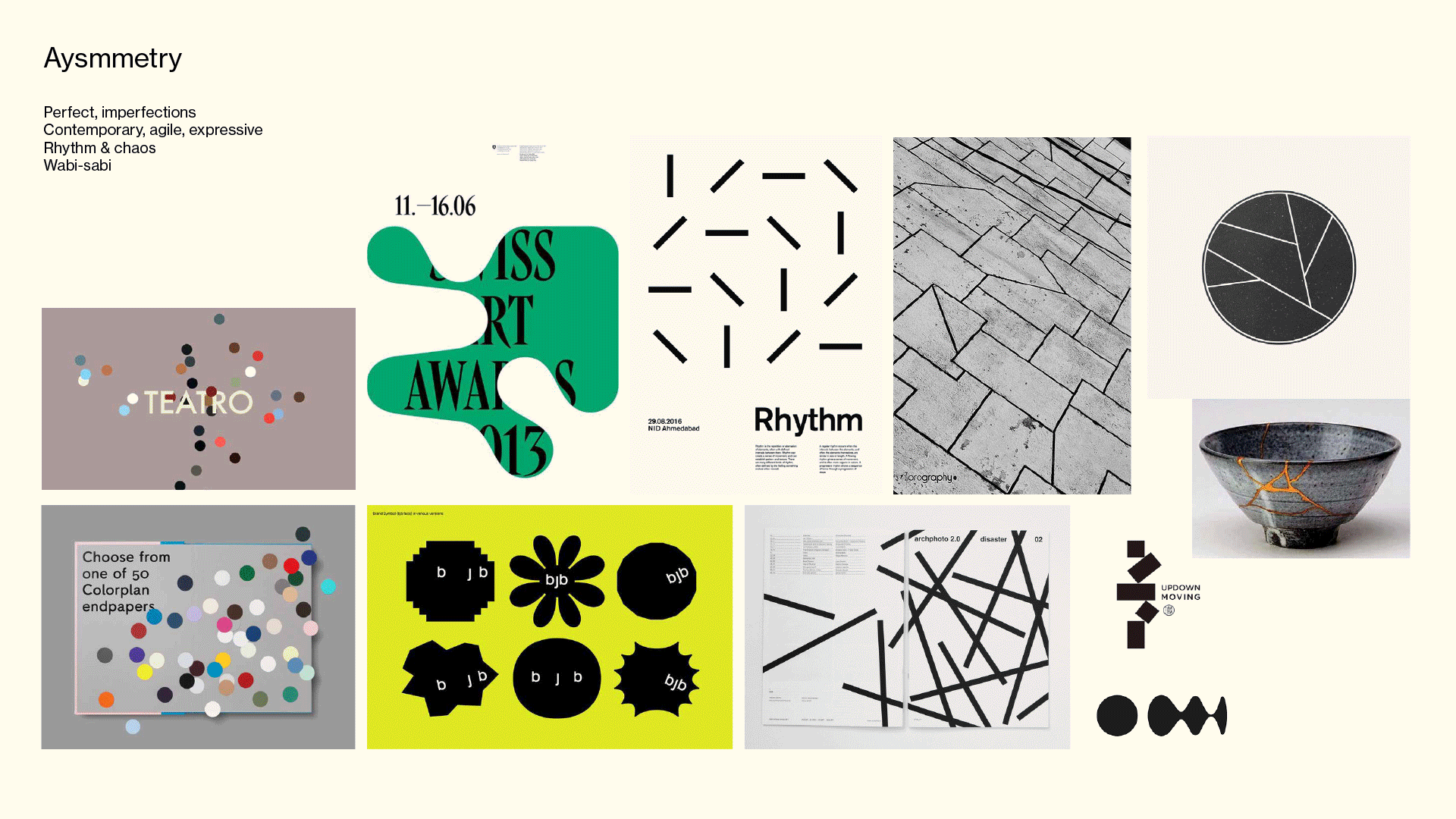
symmetry &
asymmetry
The wordmark reflects the studio’s philosophy of balance through contrast. Clean, architectural letterforms are disrupted by deliberate asymmetries, echoing the way great design thrives on tension between precision and creativity.
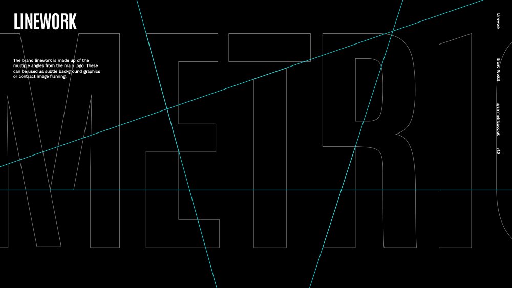
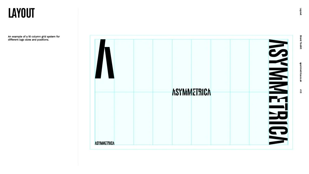
The angular geometry within each letterform established a distinctive grid system, creating a strong visual foundation for the wider brand identity.